Saturday, May 31, 2008

Show Your Appreciation

Hope something on this blog has been useful to you and I assume that’s why you are here. It’s indeed my pleasure to have you helped you! Given below are some methods in which you can show your appreciation.

Donate
Make a small donation to cover my basic costs. Remember, every dollar counts, so donate only what you are comfortable with. And there’s no obligation at all; donate only if you wish to do so. :-) Use the PayPal Donate button in the sidebar to donate.

Link to This Blog
You are absolutely free to use the various resources such as images, scripts etc provided with some of the tutorials. However, if you do use them, I appreciate if you can put The Blogger Guide to your Blog List and/or write a post in your blog linking to the relevant tutorial

Bookmark the Articles
Sharing and bookmarking the articles is another good way to say thanks. Submit to Digg, Stumble, add to Technorati favorites or add to whatever social bookmarking service you use.

Rate My Posts/Blog
If you found this blog via an answer given by me on a forum such as Blogger Help Group, Blogger Forum or BlogCatalog, then please rate or rank my posts/blog on those forums.

Spread the Word
Tell your friends and family; refer them to The Blogger Guide.

Thank You,
ids.

Friday, May 30, 2008

Scribe with a wider post area

Article Series: Wider 2 Column Templates - Step by Step Guides

Here are the steps to increase the width of the main post area of the Scribe template by a desired amount. This is useful if you frequently upload images/embed videos etc that are wider than the default width of the post column.

1) Decide the amount of pixels by which you want to increase the width of the post area. In this article, I will be expanding it by 200 pixels. (In fact, you can pick an arbitrary size and experiment to see if that is enough for you)

2) Increase the width of the post area

  • Go to Layout -> Edit HTML
  • Locate the #main CSS selector (Do a Find using your browser)
  • Increase its width property by adding the amount of pixels picked in step (1). Here we change it to 630 by adding 200 to the default width of 430 pixels

#main {
width:630px;
float:$endSide;
...
}

3) Increase the width of the other wrappers to accommodate the expanded main wrapper.
  • Locate the following CSS sections
  • Change their width property to 900 pixels

#outer-wrapper {
...
width:900px;
...
}

#main-top {
width:900px;
...
}

#main-bot {
width:900px;
...
}

#wrap2 {
width:900px;
...
}

4) Replace the other background images with expanded ones as necessary.
  • Add a template variable to define the image host location as explained here. (This step will open up in a separate window. Return to the next bullet point after that)
  • Locate the following CSS selectors.
  • Replace the URLs of the images to the ones shown in red below.

#main-top {
width:900px;
height:49px;
background:#FFF3DB url("$imageHost/scribe_bg_paper_top_w.jpg") no-repeat top left;
...
}

#main-bot {
width:900px;
height:81px;
background:#FFF3DB url("$imageHost/scribe_bg_paper_bot_w.jpg") no-repeat top left;
...
}

#wrap2 {
width:900px;
background:#FFF3DB url("$imageHost/scribe_bg_paper_mid_w.jpg") repeat-y;
...
}

#header {
background:url("$imageHost/scribe_divider_w.gif") no-repeat bottom $startSide;
}

#footer {
clear:both;
background:url("$imageHost/scribe_divider_w.gif") no-repeat top $startSide;
...
}

That's it! Click SAVE TEMPLATE and you should now have more room to play around with, in your main post area.

Note: You are free to use the images provided by me. But if you change your template according to this tutorial and use those images, please add the following code shown in red, right to the end of your template, in the place shown. It will simply link to this blog.

</div>

<a href="http://www.bloggerguide.lk/2008/04/wider-2-column-templates-step-by-step.html">Wider Two Column Modification</a> courtesy of <a href="http://www.bloggerguide.lk">The Blogger Guide</a>

</body>
</html>

Tuesday, May 27, 2008

Denim with a wider post area

Article Series: Wider 2 Column Templates - Step by Step Guides

Here are the steps to increase the width of the main post area of the Denim template by a desired amount. This is useful if you frequently upload images/embed videos etc that are wider than the default width of the post column.

1) Decide the amount of pixels by which you want to increase the width of the post area. In this article, I will be expanding it by 200 pixels. (In fact, you can pick an arbitrary size and experiment to see if that is enough for you)

2) Increase the width of the post area

  • Go to Layout -> Edit HTML
  • Locate the #main-wrapper CSS selector (Do a Find using your browser)
  • Increase its width property by adding the amount of pixels picked in step (1). Here we change it to 664 by adding 200 to the default width of 464 pixels.

#main-wrapper {
width: 664px;
float: $startSide;
...
}

3) Increase the width of the other wrappers to accommodate the expanded main wrapper.
  • Locate the CSS sections called #content-wrapper and #header
  • Increase their width property by the same amount of pixels selected in step (1)

#content-wrapper {
width: 960px;
margin: 0 auto;
...
}

#header {
width: 960px;
margin: 0 auto;
...
}

That's it! Preview and experiment with different increments. Click SAVE TEMPLATE once you get the required increment.

You should now have more room to play around with, in your main post area.

Sunday, May 25, 2008

Understanding the robots.txt File

The robots.txt file is useful in blocking off some of the pages of your blog/site from search engine crawlers. In this article, we will take a look at some of the commonly asked question about the robots.txt file, with a particular focus on Blogger blogs.

The questions are ordered with a logical flow so that you can read them from top to bottom as well.


What is a Robot?
A Robot (aka wanderer, crawler or spider) is a computer program that traverses the web automatically.

Even though these names give you the feeling that these programs “travel around” the Internet, they really don’t travel from computer to computer. What they, in fact, do is to follow the hyperlinks found on web pages by issuing download requests for each of those hyperlinked pages.

Crawling, however, is a separate topic that falls beyond the scope of this article.

What is the robots.txt file?
This is a simple ASCII text file and its name must be written in all lowercase letters as robots.txt. It should be located at the root directory of your domain. Usually, in a website, this is where you keep your index.html file.

In Blogger blogs, this is located at the following address.

http://<your-blog-name>.blogspot.com/robots.txt

For example, if your blog name is my-great-blog, then your robots.txt file can be viewed by typing the following address in to browser’s address bar.

http://my-great-blog.blogspot.com/robots.txt

What is the format of this file?
A typical robots.txt file consists of one or more sets of rules or directions for search engine robots. Each set of rules comprises of two or more instructions written on adjacent new lines. Rule sets are separated by blank new lines.

Here’s a typical example file from a blogspot blog. (Line numbers are added for referencing only. The actual file does not contain them)

1: User-agent: Mediapartners-Google
2: Disallow:
3:
4: User-agent: *
5: Disallow: /search

Lines 1 & 2 form one set of rules and lines 4 & 5 form another set. They are separated by the blank line 3.

A typical rule set starts with a User-agent: line which identifies one or more robots. Then it will have one or more Disallow: [or Allow:] commands, in separate, adjacent new lines.

For example, in the second rule set above:
  • User-agent: * - means all user agents
  • Disallow: /search - means “don’t crawl any URL that starts with http://.blogspot.com/search/…. In Blogger, this rule will block off all Labels. It’s added by default, because the Label pages just display the individual pages belonging to that label, which the robots will anyway find while crawling the rest of the site.

For more details see:

What is the use of the robots.txt file?
As you’ve probably realized by now, the robots.txt file is used to prevent robots from crawling certain areas of your site/blog.

However, remember that not all robots respect this file. For example, spam bots, which scan the web to steal email addresses, can ignore the Disallow: commands and enter those pages. So the robots.txt file is not a good way to hide your secure information.

Can I edit the robots.txt file?
Unfortunately, Blogger users cannot edit their robots.txt file. It is maintained by Blogger itself and you cannot upload your own file instead of the default one.

But, if you manage a site where you can upload files to the root domain, then you can use the tools provided by the Google Webmaster Tools (GWT) console to edit the robots.txt file. Once you have verified your blog with GWT, this is available from the Tools section of the left side navigation bar.


The Analyze robots.txt tool lets you test your rules to see what URLs they actually allow or disallow. This is good to avoid any un-intentional block offs by syntax errors in your file.

The Generate robots.txt tool has a simple user interface to create a file, even if you are not sure of the file’s syntax. Once generated, you can download the file to your machine and then upload it to your site’s root domain.

Wednesday, May 21, 2008

Template Variables

The new Layouts templates have "template variables", which are very useful when it comes to defining the look and feel of your blog. Here are some commonly asked questions about template variables.

What is a template variable?
A variable in programming can be considered as a placeholder for a value that can change from time to time. A variable can be assigned a value and, from elsewhere in the computer program, you can use that assigned value. Template Variables in Blogger is just the same concept applied within the scope of Blogger templates.

Where can I see them?
These variable are usually located right at the beginning of the blog skin. When you open your template Edit HTML mode (i.e. Layout -> Edit HTML), you can see a section called "Variable definitions". All the variable are defined in this section.

What is the format of a variable?
A template variable is defined in a syntax similar to XML/HTML elements, inside a <Variable> tag. However, these tags don't have a closing tag (i.e. </Variable>) nor they are empty elements (i.e. <Variable .../>).

Each variable has 5 attributes.
  • name: The unique name or id of the variable. The name cannot contain spaces
  • description: A short description of the variable. This is what works as the "display name" of the variable in the Font and Colors pane. (See figure below)
  • type: The type of the variable (See the next question for more details)
  • default: The template default value for the variable. Whenever you choose the "Revert to template default" option, it is this value that gets applied to the variable in concern.
  • value: The current value of the variable.
The link between a variable description and its display name is illustrated below.


What are the different types of variables?
Currently, there are 3 types of variables. They are:
  • color: Different color elements such as Text Color, Page Background Color etc.
  • font: Different fonts used in the template such as Text Font, Sidebar Title Font etc.
  • automatic: Miscellaneous variables [e.g. startSide and endSide, that are used to control the "reading order" (left-to-right or right-to-left) of the blog language]
font and color variables are editable both through the Fonts and Colors pane and the Edit HTML mode, whereas the automatic variables are only modifiable via the Edit HTML mode.

How can I add a new variable?
You can add new variables very easily. Copy and paste an existing variable of the type you want and provide a unique name and a description for it. If it is a font or color variable, it will be readily visible in the Font and Colors pane.

For example, to add a variable to control the sidebar text font in Minima template, you can add the following variable to the "Variable definitions" section. (Additional lines breaks are added for clarity. All of this can be in the same line)

<Variable
name="sidebarbodyfont"
description="Sidebar Text Font"
type="font"
default="normal normal 100% Georgia, Serif"
value="normal normal 100% Georgia, Serif"
>

Once added, it will be visible as follows.

But adding the variable is only part of the job. Next you have to use it in the relevant CSS selector. In this example, we need to modify the .sidebar selector and insert the line shown in red below. Note that when variables are used (i.e. referenced) elsewhere in the template, its name should be prefixed with a '$' character.

.sidebar {
color: $sidebartextcolor;
line-height: 1.5em;
font: $sidebarbodyfont;
}

What is the scope of template variables?
These variables are visible and available (scope in programming terms) for use only in the Edit HTML mode of your template. Once a blog page actually gets loaded, all the uses of the variables (all $name instances) get substituted with the actual value of the variable defined in the value attribute.

They cannot be used from the blog post editor as well.

Saturday, May 17, 2008

The Text Widget


The Text widget is one of the simplest widgets available on Blogger.


You can provide a title for your widget (Label 1) and type some descriptive text in its body (Lable 2). There is a Rich Text editor (Lable 3) which allows you to apply some basic formatting such as bold face, font colors from a toolbar. The toolbar has a button to add hyperlinks as well.

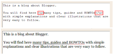
If you know HTML, there is an Edit HTML mode (Label 4) which gives you more options for formatting text. Using this mode, for example, you can underline text, which you can't do using the toolbar. (See figure below for an illustration of that)


Possible Uses

  • Display an About description specific for a blog (Profile widget cannot do this. It will display the same About in all of your blogs)
  • Display some common message such as a Disclaimer on all your blog pages

Tuesday, May 13, 2008

Blogger Widgets

Widgets are the add-ons to your blog. Some of the widgets such as Blog, Archive and Header come by default when you select a template. Also there are many other different types of widgets offered by Blogger that you can plug in using the Add Page Element option in your Layout editor.

This is an article series that will cover the details about the different types of widgets available on Blogger and their possible uses. In each of the articles in this series, you will find simple illustrations of those widgets as well as the finer details about them.

The currently available widgets are:

  • Text
  • Blog
  • Archive
  • Profile
  • Labels
  • HTML/Javascript
  • List
  • Link List
  • Header
  • Picture
  • Slideshow
  • AdSense
  • Feed
  • Newsreel
  • Video Bar
  • Logo
Last Updated: 2008 May 17

Sunday, May 11, 2008

3 Columns : Dark Dots : Left and Right Sidebars

Article Series: 3 Column Step by Step Guides

Here are the steps to convert a default 2 column Dark Dots template in to a three column template with two sidebars on left and right hand sides of the main post area.

(If you really want to understand what's happening here, read the article series Three Column Templates Explained.)

1) Add new CSS id selectors for the 2nd sidebar wrapper.

  • Go to Layout -> Edit HTML
  • Locate the #sidebar-wrapper and the #sidebar sections (Do a Find using your browser)
  • Copy both section fully and paste below the existing sidebar sections (it doesn't have to below) and rename them to #sidebar-wrapper-two and #sidebar-two
  • Change the float: $startSide to float:$endSide of the #sidebar-wrapper-two section (See the code snippet below)

#sidebar-wrapper {
width:200px;
float:$startSide;
font-size:85%;
padding-bottom:20px;
word-wrap: break-word; /* fix for ... */
overflow: hidden; /* fix for ... float */
}

#sidebar {
background:url("http://www.blogblog.com/dots_dark/bg_minidots2.gif") 150px -50px;
padding:40px 10px 15px;
width:200px;
width/* */:/**/180px;
width: /**/180px;
}

#sidebar-wrapper-two {
width:200px;
float:$endSide;
font-size:85%;
padding-bottom:20px;
word-wrap: break-word; /* fix for ... IE */
overflow: hidden; /* fix for ... float */
}

#sidebar-two {
background:url("http://www.blogblog.com/dots_dark/bg_minidots2.gif") 150px -50px;
padding:40px 10px 15px;
width:200px;
width/* */:/**/180px;
width: /**/180px;
}


2) Introduce a new div element, as a child of the content-wrapper, to be the placeholder for the 2nd sidebar
  • Locate the <div id='main-wrapper'> element.
  • Copy the code shown in red, above that section (this has to be above)
<div id='crosscol-wrapper' style='text-align:center'>
<b:section class='crosscol' id='crosscol' showaddelement='no'/>
</div>

<div id='sidebar-wrapper-two'>
<b:section class='sidebar' id='sidebar-two' preferred='yes'>
</b:section>
</div>

<div id='main-wrapper'>
<b:section class='main' id='main' showaddelement='no'>
<b:widget id='Blog1' locked='true' title='Blog Posts' type='Blog'/>
</b:section>
</div>


3) Expand the width of the other wrappers to accommodate the new sidebar
  • Locate the CSS section called #outer-wrapper
  • Change its width property to 900 pixels

#outer-wrapper {
background:url("...") no-repeat 250px 50px;
width:900px;
...
}

4) Do necessary adjustments to margins, padding etc
  • Locate the #main-wrapper section
  • Insert a right margin of 22 pixels.

#main-wrapper {
width: 450px;
margin-right:22px;

float: $endSide;
...
}


5) Modify the CSS rules for the wire frame layouts editor.
  • Locate the section marked as /* Page structure tweaks for layout editor wireframe */
  • Replace that entire section with the code marked in red below.

/** Page structure tweaks for layout editor wireframe */

body#layout #outer-wrapper {
padding: 0;
width: 900px;
}

body#layout #main-wrapper {
padding: 0;
width: 400px;
}

body#layout #sidebar-wrapper,
body#layout #sidebar-wrapper-two {
padding: 0;
width: 200px;
}

]]></b:skin>


Save the template. Switch to Page Elements view and enjoy your 3 column template!

Thursday, May 1, 2008

3 Column Templates : Scribe : Left and Right Sidebars

Article Series: 3 Column Templates Step by Step Guides

Here are the steps to convert a Blogger default 2 column Scribe template in to a 3 column template with sidebars on left and right hand sides of the main post area.

(If you really want to understand what's happening here, read the article series Three Column Templates Explained.)

1) Add a new CSS id selector for the 2nd sidebar wrapper.

  • Go to Layout -> Edit HTML
  • Locate the #sidebar selector (Do a Find using your browser)
  • Copy that full section and paste below the existing sidebar section (it doesn't have to below) and rename it to #right-sidebar
  • Change the float: $startSide to float:$endSide of the #right-sidebar selector
  • Change its width property to 200 pixels (See the code snippet below)

#sidebar {
width:150px;
float:$startSide;
padding:8px 0;
margin:0;
word-wrap: break-word; /* fix for ... in IE */
overflow: hidden; /* fix for ... */
}

#right-sidebar {
width:200px;
float:$endSide;
padding:8px 0;
margin:0;
word-wrap: break-word; /* fix for ... in IE */
overflow: hidden; /* fix for ... */
}

2) Introduce a new div element, as a child of #wrap3, to be the placeholder for the 2nd sidebar
  • Locate the <div id='footer-wrapper'> element.
  • Copy the code shown in red, above that section (this has to be above)

<b:section class='main' id='main' showaddelement='no'>
<b:widget id='Blog1' locked='true' title='Blog Posts' type='Blog'/>
</b:section>

<div id='right-sidebar-wrapper'>
<b:section class='sidebar' id='right-sidebar' preferred='yes'>
</b:section>
</div>

<div id='footer-wrapper'>
<b:section class='footer' id='footer'/>
</div>

3) Expand the width of the parent wrappers to accommodate the new sidebar
  • Locate the following CSS sections
  • Change their width property to 900 pixels

#outer-wrapper {
...
width:900px;
...
}

#main-top {
width:900px;
...
}

#main-bot {
width:900px;
...
}

#wrap2 {
width:900px;
...
}

4) Do necessary adjustments to margins, padding, floating etc
  • Locate the #main section
  • Insert a left margin of 7 pixels.
  • Change its float property to $startSide

#main {
width:430px;
float:$startSide;
padding:8px 0;
margin:0;
margin-left:7px;
...
}

5) Modify and expand the background images as necessary.
  • Add a template variable to define the image host location as explained here. (This step will open up in a separate window. Return to the next bullet point after that)
  • Locate the following CSS selectors.
  • Replace the URLs of the images to the ones shown in red below.

#main-top {
width:900px;
height:49px;
background:#FFF3DB url("$imageHost/scribe_bg_paper_top_w.jpg") no-repeat top left;
...
}

#main-bot {
width:900px;
height:81px;
background:#FFF3DB url("$imageHost/scribe_bg_paper_bot_w.jpg") no-repeat top left;
...
}

#wrap2 {
width:900px;
background:#FFF3DB url("$imageHost/scribe_bg_paper_mid_w.jpg") repeat-y;
...
}

#header {
background:url("$imageHost/scribe_divider_w.gif") no-repeat bottom $startSide;
}

#footer {
clear:both;
background:url("$imageHost/scribe_divider_w.gif") no-repeat top $startSide;
...
}

Save the template. Switch to Page Elements view and enjoy your 3 column template! (The new sidebar might not be visible until you add some gadgets to it)

Note: You are free to use the images provided by me. But if you change your template according to this tutorial and use those images, please add the following code shown in red, right to the end of your template, in the place shown. It will simply link to this blog.

</div>

<a href="http://www.bloggerguide.lk/2008/02/3-columns-step-by-step-guides.html">Three Column Modification</a> courtesy of <a href="http://www.bloggerguide.lk">The Blogger Guide</a>

</body>
</html>


HOWTO: Backup and Restore your Template

Blogger provides an option where you can edit the template directly in HTML mode. This mode allows you to do a lot more customization than possible using its standard interfaces. For example, if you want to convert your blog to 3 columns or increase the width of your post area, you can do it using the Edit HTML mode.

However, most non-technical Bloggers are somewhat afraid of trying out such changes, even by following simple step by step guides. The Backup and Restore option should give you that additional bit of confidence to go ahead and try out a bit of tinkering by yourself.

This article will illustrate how you can back up and restore your template. It's very easy.


Backup
To backup your template go to Layout -> Edit HTML. The very first option in this pane is "Backup / Restore Template". Under that click the link "Download Full Template" (See Label 1 in the above figure). Choose the option to "Save" from the next dialog that pops up. Browse to the location you want to save it (e.g. Desktop) and click Save.

The template will be downloaded to the specified location. It's a small XML file and will be named as "template-<your blog id>.xml" where <your blog id> is a long series of digits. That's it; this XML file has all the details of your current template.

Restore
Restoring is also as simple as backing up.

Let's say you tried out some changes for your template and didn't get it right. When you try to save your template you get this frightening error message in red! (Clear Edits will not work here because you have saved your changes)

Don't panic. Remember you backed up your template earlier. Just click the Browse button (Label 2 in above figure) of the Backup / Restore option and browse to the downloaded template file and click Open. Then click Upload (Label 3). Then Blogger will restore your template to the state it was, prior to your edits. Then save your restored template.

You will be back to square one. Try your change some other day. As long as you back it up properly, you can restore it until you get your change right. :)