Saturday, March 29, 2008

Meta Tags FAQ

Meta tags are used to add additional information about the pages in a site/blog. A list of common questions and answers regarding meta tags are given below.

What is a meta tag?
What are the different types of meta tags?
How do I add one to my blog?

What is a meta tag?
The word meta carries the meaning about. For example, in database theory, the term metadata means data about data held in a database. Similarly, the meta tag carries information (or data) about the content in a web site or page.

The general format of a meta tag is:

<meta property value/>

where the property signifies the name of a property to which the meta tag relates and the value is the actual value taken by that property. The value of the meta tag is always provided using the content attribute.

What are the different types of meta tags?
Meta tags differ by the type of the property (see above question) they describe. These properties are defined using the following attributes of the meta tag. (Note: This is not a complete reference of the attributes. Only some of the commonly used ones are listed here)

name
The name attribute is used to define some of the most commonly used meta tags, namely, author, description and keywords.

  • author - used to define the author of a web page
  • description - used to provide a general description about a web page
  • keywords - used to provide a list of keywords that the search engines can use in indexing a web page
<meta name="author" content="ids"/>
<meta name="keywords" content="Blogger Tips, Blogger Guides, 3 Column Template Tips"/>
<meta name="description" content="A blog containing tips and guides on Blogger with clear and simple technical explanations"/>

http-equiv
This attribute provides another very commonly used functionality, redirecting. If used normally, it will only instruct the browser to refresh (i.e. reload) a page after a specified number of seconds. However, by providing an alternate URL, it is possible to load a different page when refreshing; i.e. a redirect is affected.

Reload the same page after 5 seconds:
<meta http-equiv="refresh" content="5"/>

Redirect to the given URL (specify 0 as time to affect an immediate redirect):
<meta http-equiv="refresh" content="0;url=http://example.com"/>

How do I add one to my blog?
The meta tags are added to the Blogger template. Go to the Edit HTML mode of your Layout editor and paste the meta tag after the <head> tag. See the figure below for an illustration of this step.


Reference:

Friday, March 21, 2008

HTML Entities

HyperText Markup Language (or HTML as commonly known) is the language used in writing up documents for the web. This language provides the necessary markup to define the structure and content of a web document (or page). Each of these markups are formally called HTML elements. Usually an element consist of an opening tag and a closing tag, which mark the beginning and the end of the element respectively. For example the paragraph element, which marks up a paragraph of text, has the opening tag <p> and the closing tag </p>.

As you just saw, each HTML element is enclosed within angle brackets or within the two characters '<' and '>'. Since these two characters have a special meaning within the context of an HTML document, it is not possible to literally use them in a document. So what if you want to include these characters in the actual page that is shown on the browser? The answer is HTML entities.

The HTML has a set of characters called HTML entities to be used when including the characters that have special meaning in the language, inside an HTML page. For example, if you want to include an HTML or XML code snippet in your document, then you have to use these entities.

An entity consist of 3 parts, all written together without any spaces. They are

  • the ampersand character ( & )
  • an entity name or a number
  • a semicolon

For example, the '<' character is written as '&lt;', where 'lt' is the name of the entity. You might ask... if the ampersand character is used in all entities, how do I represent the ampersand character itself? Good question. The answer is, there is another entity to denote the ampersand character which goes as '&amp;'. It can get somewhat confusing at times. This type of mechanism is called an escape sequence in programmers' jargon.

To illustrate the use of entities let's take the following simple snippet.

<html>
<head>
<title>Test Page</title>
</head>
<body>
<p>
Hello World!
</p>
</body>
</html>

To get the <html> to appear like that on the browser, what I typed in to the actual HTML code is &lt;html&gt;. Confused? No it's not that difficult. This is what happens. When the browser reads an HTML document from beginning to end (yes, the browser also reads it as we do; technically this is called parsing) every &lt; that it comes across will be replaced with the single character '<', before displaying the page for the human readers. Similarly, every HTML entity will be replaced with its corresponding display character.

What's the use of HTML entities anyway? Well, as I said before, one use is when we want to display code snippets in our page. Then there are some characters that we cannot type using the keyboard such as the '£' and the '€', which we can insert using HTML entities. Here's a full list of HTML entities from the W3Schools site.

A simple technique to replace entities
If you want to include a code snippet in one of your articles, you might have to replace many less-than and greater-than signs with the corresponding entities. This can be pretty cumbersome even for a few lines of code.

You can use a very basic text editor such as the Notepad (on Windows) to do it easily. Here's how.
  1. Copy the code snippet in to a new Notepad document
  2. Go to Edit -> Replace... (or Ctrl+H) and type '<' in the Find what box. Type '&lt;' in the Replace With box.
  3. Click Replace All
  4. Repeat this for all the entities that you want to replace. (For example, '>' with '&gt;' and '"' with '&quot;')

The following figure illustrates this simple technique. You will find it very useful whenever you need to parse a code snippet that includes special characters to be embedded inside an HTML page.

Thursday, March 20, 2008

3 Column Templates : Denim : Two Right Sidebars

Article Series: 3 Column Templates Step by Step Guides

Here are the steps to convert a Blogger default 2 column Denim template in to a 3 column template with two sidebars on the right hand side of the main post area.

(If you really want to understand what's happening here, read the article series Blogger Three Column Templates Explained.)

Note: Back up your template before you start any modifications.

1) Add a new CSS id selector for the 2nd sidebar wrapper.

  • Go to Layout -> Edit HTML
  • Locate the #sidebar-wrapper section (Do a Find using your browser)
  • Copy that full section and paste below the existing sidebar section (it doesn't have to below) and rename it to #sidebar-wrapper-two
  • Change the float: $endSide to float:$startSide of the existing sidebar section (See the code snippet below)

#sidebar-wrapper {
margin-$endSide: 14px;
width: 240px;
float: $startSide;
background-color: $mainBgColor;
display: inline; /* fix for ... IE */
word-wrap: break-word; /* fix for long ... */
overflow: hidden; /* fix for long non ... */
}

#sidebar-wrapper-two {
margin-$endSide: 14px;
width: 240px;
float: $endSide;
background-color: $mainBgColor;
display: inline; /* fix for doubling ... */
word-wrap: break-word; /* fix for long ... */
overflow: hidden; /* fix for long non ... */
}

2) Introduce a new div element, as a child of the content-wrapper, to be the placeholder for the 2nd sidebar
  • Locate the <div id='sidebar-wrapper'> element.
  • Copy the code shown in red, below that section (this has to be below)

<div id='sidebar-wrapper'>
<b:section class='sidebar' id='sidebar' preferred='yes'>
<b:widget id='Profile1' locked='false' title='About Me' type='Profile'/>
<b:widget id='BlogArchive1' locked='false' title='Blog Archive' type='BlogArchive'/>
</b:section>
</div>

<div id='sidebar-wrapper-two'>
<b:section class='sidebar' id='sidebar-two' preferred='yes'>
</b:section>
</div>

<!-- spacer for skins that want sidebar and main to be the same height-->
<div class='clear'> </div>


3) Expand the width of the other wrappers to accommodate the new sidebar
  • Locate the CSS sections called #header and #content-wrapper
  • Change their width property to 1000 pixels

#header {
width: 1000px;
margin: 0 auto;
...
}

#content-wrapper {
width: 1000px;
margin: 0 auto;
...
}

4) Do necessary adjustments to margins, padding etc
  • Locate the #sidebar-wrapper section
  • Change its right margin to 11 pixels.
  • Add a left margin of 11 pixels.

#sidebar-wrapper {
margin-$endSide: 11px;
margin-$startSide: 11px;
width: 2404px;
...
}

Note: Step 5 is only needed if your Layout Editor does not show the newly added sidebar. There was an issue where the Firefox browser didn't show a 3 column template fully in the edit mode. But Blogger reports that the issue has been fixed now.

5) Modify the CSS rules for the wire frame layouts editor.
  • Locate the end of the skin denoted by "]]>"
  • Add the following code above that line.

/** Page structure tweaks for layout editor wireframe */

body#layout #outer-wrapper {
padding-top: 0;
width:740px;
}
body#layout #header,
body#layout #content-wrapper,
body#layout #footer {
padding: 0;
width:740px;
}

body#layout #main-wrapper {
width:400px;
}

body#layout #sidebar-wrapper,
body#layout #sidebar-wrapper-two {
width:140px;
}

]]></b:skin>

Save the template. Switch to Page Elements view and enjoy your 3 column template!

3 Column Templates : Denim : Left and Right Sidebars

Article Series: 3 Column Templates Step by Step Guides

Here are the steps to convert a Blogger default 2 column Denim template in to a 3 column template with two sidebars on left and right hand sides of the main post area.

(If you really want to understand what's happening here, read the article series Blogger Three Column Templates Explained.)

1) Add a new CSS id selector for the 2nd sidebar wrapper.

  • Go to Layout -> Edit HTML
  • Locate the #sidebar-wrapper section (Do a Find using your browser)
  • Copy that full section and paste below the existing sidebar section (it doesn't have to below) and rename it to #left-sidebar-wrapper
  • Change the float: $endSide to float:$startSide of this newly copied section (See the code snippet below)

#sidebar-wrapper {
margin-$endSide: 14px;
width: 240px;
float: $endSide;
background-color: $mainBgColor;
display: inline; /* fix for ... IE */
word-wrap: break-word; /* fix for long ... */
overflow: hidden; /* fix for long non ... */
}

#left-sidebar-wrapper {
margin-$endSide: 14px;
width: 240px;
float: $startSide;
background-color: $mainBgColor;
display: inline; /* fix for doubling ... */
word-wrap: break-word; /* fix for long ... */
overflow: hidden; /* fix for long non ... */
}

2) Introduce a new div element, as a child of the content-wrapper, to be the placeholder for the 2nd sidebar
  • Locate the <div id='main-wrapper'> element.
  • Copy the code shown in red, above that section (this has to be above)

<div id='crosscol-wrapper' style='text-align:center'>
<b:section class='crosscol' id='crosscol' showaddelement='no'/>
</div>

<div id='left-sidebar-wrapper'>
<b:section class='sidebar' id='left-sidebar' preferred='yes'>
</b:section>
</div>

<div id='main-wrapper'>
<b:section class='main' id='main' showaddelement='no'>
<b:widget id='Blog1' locked='true' title='Blog Posts' type='Blog'/>
</b:section>
</div>


3) Expand the width of the other wrappers to accommodate the new sidebar
  • Locate the CSS sections called #header and #content-wrapper
  • Change their width property to 1000 pixels

#header {
width: 1000px;
margin: 0 auto;
...
}

#content-wrapper {
width: 1000px;
margin: 0 auto;
...
}

4) Do necessary adjustments to margins, padding etc
  • Locate the #main-wrapper section
  • Change its left margin to 11 pixels.

#main-wrapper {
margin-$startSide: 11px;
width: 464px;
...
}

  • Locate the newly added #left-sidebar-wrapper section
  • Change the side of its margin from $endSide to $startSide.

#left-sidebar-wrapper {
margin-$startSide: 14px;
width: 240px;
...
}

Note: Step 5 is only needed if your Layout Editor does not show the newly added sidebar. There was an issue where the Firefox browser didn't show a 3 column template fully in the edit mode. But Blogger reports that the issue has been fixed now.

5) Modify the CSS rules for the wire frame layouts editor.
  • Locate the end of the skin denoted by "]]>"
  • Add the following code above that line.

/** Page structure tweaks for layout editor wireframe */

body#layout #outer-wrapper {
padding-top: 0;
width:740px;
}
body#layout #header,
body#layout #content-wrapper,
body#layout #footer {
padding: 0;
width:740px;
}

body#layout #main-wrapper {
width:400px;
}

body#layout #sidebar-wrapper,
body#layout #left-sidebar-wrapper {
width:150px;
}

]]></b:skin>

Save the template. Switch to Page Elements view and enjoy your 3 column template!

Monday, March 17, 2008

HOWTO: Submit a Sitemap to Google Webmaster Tools

Update (Jan 2009):
This article explains the earlier interface of Sitemap submission. For the new simplified interface go here.

In a previous article we looked at how you can submit your site to Google Webmaster Tools (GWT). Once you submit your blog and verify your ownership to GWT, the next step is to add a sitemap.

Put in a simple way, a Sitemap is an XML file carrying the details of the posts in your blog. Because it is an XML file, computers (computer programs to be precise) find it easy to read it. Such files are also known as machine readable files. (Note, however, that the Sitemaps we refer to here are different from the human readable HTML pages that certain web sites carry, which guide the human visitors to all the pages on those sites). These Sitemaps are processed by search engine spiders such as the Googlebot, to discover the pages in web sites/blogs. Sitemaps are particularly useful to be used with blogs that have dynamic content. See the About Sitemaps help topic on GWT help center for more information on them.

The purpose of this article is to illustrate how to add a Sitemap of your blog to GWT. You can accomplish this by following the steps given below.

1) Login to GWT and click Sitemap -> Add for the relevant blog. (if you have submitted more than one blog, all of them will appear in your dashboard)

2) Choose General Site Map from the next screen.

3) Under the 3rd option which reads as My Sitemap URL is, type the following line.

feeds/posts/default?max-items=500&start-index=1

http://[your blog name].blogspot.com/feeds/posts/default is the default RSS feed for your blog. Since the RSS feed is an XML file, that can work as a Sitemap. The two parameters we provided in the above line instruct GWT to take 500 posts starting from the first post, as the content of this Sitemap. Later, if you want to add the second 500 posts, all you have to do is to add another Sitemap which looks like:

feeds/posts/default?max-results=500&start-index=501.

It is not a must to submit 500 posts at a time. It can be any number as long as the Sitemap does not exceed the limit of 50,000 URLs or 10MB in size.

4) Click Add General Site Map

You will see a confirmation page once the Sitemap is successfully added. Be a little patient until the Googlebot consumes this and build up the index for your blog. Remember, it can take well over a month for indexing to happen.

The following figure illustrates the 4 steps just described.

Saturday, March 15, 2008

3 Columns : Minima : Two Right Sidebars

Article Series: 3 Column Step by Step Guides

Here are the steps to convert a default 2 column Minima template in to a three column template with two sidebars on the right hand side of the main post area. This conversion will also work on Minima Black, Minima Blue and Minima Ochre.

(If you really want to understand what's happening here, read the article series Three Column Templates Explained.)

1) Add a new CSS id selector for the 2nd sidebar wrapper.

  • Go to Layout -> Edit HTML
  • Locate the #sidebar-wrapper section (Do a Find using your browser)
  • Copy that full section and paste below the existing sidebar section (it doesn't have to be below) and rename it to #sidebar-wrapper-two
  • Change the float: $endSide to float:$startSide of the #sidebar-wrapper section (See the code snippet below)
#sidebar-wrapper {
width: 220px;
float: $startSide;
word-wrap: break-word; /* fix for ... IE */
overflow: hidden; /* fix for long ... float */
}

#sidebar-wrapper-two {
width: 220px;
float: $endSide;
word-wrap: break-word; /* fix for ... IE */
overflow: hidden; /* fix for ... float */
}

2) Introduce a new div element, as a child of the content-wrapper, to be the placeholder for the 2nd sidebar
  • Locate the <div id='sidebar-wrapper'> element.
  • Copy the code shown in red, below that section (this has to be below)

<div id='sidebar-wrapper'>
<b:section class='sidebar' id='sidebar' preferred='yes'>
</b:section>
</div>

<div id='sidebar-wrapper-two'>
<b:section class='sidebar' id='sidebar-two' preferred='yes'/>
</div>

<!-- spacer for skins that want sidebar and main to be the same height-->

3) Expand the width of the other wrappers to accommodate the new sidebar
  • Locate the CSS sections called #outer-wrapper, #header-wrapper and #footer
  • Change their width property to 880 pixels

#outer-wrapper {
width: 880px;
margin: 0 auto;
...
}

#header-wrapper {
width: 880px;
margin: 0 auto 10px;
...
}

#footer {
width: 880px;
clear: both;
margin: 0 auto;
...
}

4) Do necessary adjustments to margins, padding etc
  • Locate the #sidebar-wrapper section
  • Insert a left margin of 12 pixels.

#sidebar-wrapper {
width: 220px;
margin-left:12px;

...
}

5) Adjust the max width of the header description to center it in the new expanded header
  • Locate the #header .description section
  • Change the max-width property to 880 pixels.
#header .description {
...
padding:0 20px 15px;
max-width:880px;
...
}

Note: Step 6 is only needed if your Layout Editor does not show the newly added sidebar. There was an issue where the Firefox browser didn't show a 3 column template fully in the edit mode. But Blogger reports that the issue has been fixed now.

6) Modify the CSS rules for the wire frame layouts editor.
  • Locate the end of the skin denoted by "]]>"
  • Add the following code above that line.

/** Page structure tweaks for layout editor wireframe */

body#layout #outer-wrapper {
padding-top: 0;
width:720px;
}
body#layout #header-wrapper,
body#layout #content-wrapper,
body#layout #footer {
padding: 0;
width:720px;
}

body#layout #main-wrapper {
width:400px;
}

body#layout #sidebar-wrapper,
body#layout #sidebar-wrapper-two {
width:150px;
}

]]></b:skin>

Save the template. Switch to Page Elements view and enjoy your 3 column template!

3 Columns : Minima : Left and Right Sidebars

Article Series: 3 Column Step by Step Guides

Here are the steps to convert a default 2 column Minima template in to a three column template with two sidebars on left and right hand sides of the main post area. This conversion will also work on Minima Black, Minima Blue and Minima Ochre templates.

(If you really want to understand what's happening here, read the article series Three Column Templates Explained.)

1) Add a new CSS id selector for the 2nd sidebar wrapper.

  • Go to Layout -> Edit HTML
  • Locate the #sidebar-wrapper section (Do a Find using your browser)
  • Copy that full section and paste below the existing sidebar section (it doesn't have to be below) and rename it to #left-sidebar-wrapper
  • Change the float: $endSide to float:$startSide of this newly copied section (See the code snippet below)
#sidebar-wrapper {
width: 220px;
float: $endSide;
word-wrap: break-word; /* fix for ... IE */
overflow: hidden; /* fix for long ... float */
}

#left-sidebar-wrapper {
width: 220px;
float: $startSide;
word-wrap: break-word; /* fix for ... in IE */
overflow: hidden; /* fix for long ... float */
}

2) Introduce a new div element, as a child of the content-wrapper, to be the placeholder for the 2nd sidebar
  • Locate the <div id='main-wrapper'> element.
  • Copy the code shown in red, above that section (this has to be above)

<div id='crosscol-wrapper' style='text-align:center'>
<b:section class='crosscol' id='crosscol' showaddelement='no'/>
</div>

<div id='left-sidebar-wrapper'>
<b:section class='sidebar' id='sidebar-two' preferred='yes'>
</b:section>
</div>

<div id='main-wrapper'>
<b:section class='main' id='main' showaddelement='no'>
<b:widget id='Blog1' locked='true' title='Blog Posts' type='Blog'/>
</b:section>
</div>

3) Expand the width of the other wrappers to accommodate the new sidebar
  • Locate the CSS sections called #outer-wrapper, #header-wrapper and #footer
  • Change their width property to 880 pixels

#outer-wrapper {
width: 880px;
margin: 0 auto;
...
}

#header-wrapper {
width: 880px;
margin: 0 auto 10px;
...
}

#footer {
width: 880px;
clear: both;
margin: 0 auto;
...
}

4) Do necessary adjustments to margins, padding etc
  • Locate the #main-wrapper section
  • Insert a left margin of 12 pixels.

#main-wrapper {
width: 410px;
margin-left:12px;

float: $startSide;
...
}

5) Adjust the max width of the header description to center it in the new expanded header
  • Locate the #header .description section
  • Change the max-width property to 880 pixels.
#header .description {
...
padding:0 20px 15px;
max-width:880px;
...
}

Note: Step 6 is only needed if your Layout Editor does not show the newly added sidebar. There was an issue where the Firefox browser didn't show a 3 column template fully in the edit mode. But Blogger reports that the issue has been fixed now.

6) Modify the CSS rules for the wire frame layouts editor.
  • Locate the end of the skin denoted by "]]>"
  • Add the following code above that line.

/** Page structure tweaks for layout editor wireframe */

body#layout #outer-wrapper {
padding-top: 0;
width:720px;
}
body#layout #header-wrapper,
body#layout #content-wrapper,
body#layout #footer {
padding: 0;
width:720px;
}

body#layout #main-wrapper {
width:400px;
}

body#layout #sidebar-wrapper,
body#layout #left-sidebar-wrapper {
width:150px;
}

]]></b:skin>

Save the template. Switch to Page Elements view and enjoy your 3 column template!

Sunday, March 9, 2008

HOWTO: Add your blog to Google Webmaster Tools

Google Webmaster Tools (GWT) is a service that helps you to see and control how Google sees your site/blog. It provides lot of statistics such as the index stats (i.e. what pages of your site are currently in Google's index), crawl stats etc. It lists various errors encountered by Googlebot while crawling your site. You can use it to submit sitemaps of your site to Google and also remove certain URLs of your site from the Google's index.

This article will illustrate how to add your blog to GWT and then verify it.

Add Site
Before you add a site you need to sign in to the service with a Google account. Then enter the URL of your blog's homepage and click Add Site.


Verify Site
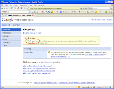
Once you add your blog, it will appear on your dashboard. Click on that and you will go the Overview page for your blog. As soon as you add it, the blog will be in the unverified state. Therefore you will see a message asking you to verify it. Verification is the process by which you confirm to GWT that you are the owner of this blog.

Click on Verify your site link.


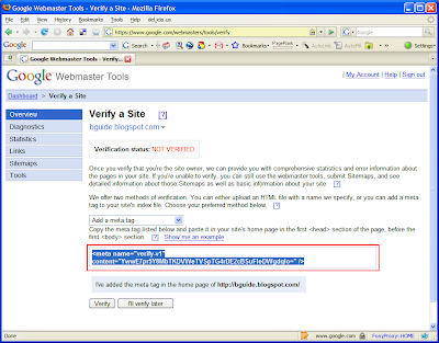
From the Verify a Site page, select Add a meta tag as the verification method.


You will then be presented with a meta tag. Copy the whole tag.


Go to your blog's Layout Editor and open the Edit HTML mode. Paste the meta tag you just copied immediately under the <head> tag. Save the template and go back to GWT.


Click on the Verify button.


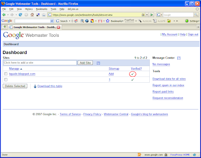
Go back to your dashboard and check whether the verification step is complete. (It might take a few minutes to get your status updated).


That's it. You have now added and verified your blog to GWT. Next step would be to submit a Sitemap to Google Webmaster Tools for Googlebot to start crawling your site.

Thursday, March 6, 2008

3 Columns : Son of Moto : Two Right Sidebars

Article Series: 3 Column Step by Step Guides

Here are the steps to convert a default 2 column Son of Moto template in to a 3 column template with two sidebars on the right hand side of the main post area.

(If you really want to understand what's happening here, read the article series Three Column Templates Explained.)

1) Add a new CSS id selector for the 2nd sidebar wrapper.

  • Go to Layout -> Edit HTML
  • Locate the #sidebar section (Do a Find using your browser)
  • Copy that full section and paste below the existing sidebar section (it doesn't have to below) and rename it to #sidebar-two
  • Change the float: $endSide to float:$startSide of the #sidebar section (See the code snippet below)

#sidebar {
width: 226px;
float: $startSide;
color: $sidebarTextColor;
word-wrap: break-word; /* fix for ... in IE */
overflow: hidden; /* fix for long ... */
}

#sidebar-two {
width: 226px;
float: $endSide;
color: $sidebarTextColor;
word-wrap: break-word; /* fix for ... IE */
overflow: hidden; /* fix for ... float */
}


2) Introduce a new div element, as a child of the content-wrapper, to be the placeholder for the 2nd sidebar
  • Locate the <div id='sidebar-wrapper'> element.
  • Copy the code shown in red, below that section (this has to be below)

<div id='sidebar-wrapper'>
<b:section class='sidebar' id='sidebar' preferred='yes'>
</b:section>
</div>

<div id='sidebar-wrapper-two'>
<b:section class='sidebar' id='sidebar-two' preferred='yes'>
</b:section>
</div>

<!-- spacer for skins that want sidebar and main to be the same height-->
<div class='clear'> </div>


3) Expand the width of the parent wrappers to accommodate the new sidebar
  • Locate the CSS section called #outer-wrapper
  • Change its width property to 918 pixels

#outer-wrapper {
margin: 0 auto;
border: 0;
width: 918px;
...
}


4) Do necessary adjustments to margins, padding etc
  • Locate the #main section
  • Insert a right margin of 14 pixels.

#main {
width: 400px;
margin-$endSide:14px;

float: $startSide;
...
}


5) Modify and expand the background images as necessary.
  • Add a template variable to define the image host location as explained here. (This step will open up in a separate window. Return to the next bullet point after that)
  • Locate the body section.
  • Replace the URL of the background image to the one shown in red below.

body {
...
background: #692 url($imageHost/sonofmoto_outerwrap_w.gif) top center repeat-y;
...
}

Note: Step 6 is only needed if your Layout Editor does not show the newly added sidebar. There was an issue where Firefox browser didn't show a 3 column template fully in the edit mode. But Blogger reports that the issue has been fixed and this step was not required when I tested these steps.

6) Modify the CSS rules for the wire frame layouts editor.
  • Locate the section that starts with "/** Page structure tweaks for layout editor wireframe */"
  • Replace that entire section with the following code.

/** Page structure tweaks for layout editor wireframe */

body#layout #outer-wrapper {
padding-top: 0;
width:720px;
}
body#layout #header,
body#layout #content-wrapper,
body#layout #footer {
padding: 0;
width:720px;
}

body#layout #main {
width:400px;
}

body#layout #sidebar,
body#layout #sidebar-two {
width:150px;
}

]]></b:skin>


Save the template. Switch to Page Elements view and enjoy your 3 column template! (Let me know if you come across any problems)

Note: You are free to use the image provided by me. But if you change your template according to this tutorial and use that image, please do a post in your blog linking to this article.

Tuesday, March 4, 2008

Dynamic Tree Control for Blogger

A tree control (i.e. the GUI element found in the left pane of Windows Explorer) provides a useful way of organizing a set of hierarchical items. This article will present a method to incorporate such a tree control in to Blogger blogs.

Before we proceed, let's take a look at how our final tree will look like.


Now let's see how to include a tree like the above in your blog.

Step 1
First step is to include two resources, a JavaScript file and a CSS file, in to the Blogger template. Copy the following two lines of code and insert them in to the head section of your template.


<link href='http://idssl.fileave.com/tbg/dtree.css' rel='StyleSheet' type='text/css'/>
<script src='http://idssl.fileave.com/tbg/dtree.js' type='text/javascript'/>

You can copy it immediately under the <head> tag as shown in the figure below. (These two resources are hosted on a free file hosting service. Don't worry, there is no tracking code or any thing of that sort there.)


Save your template and exit Edit HTML mode.

Step 2
Next step is to write the code necessary to create the tree. I will first present a sample code and then explain it.

<div class="dtree">

<p><a href="javascript: d.openAll();">open all</a> | <a href="javascript: d.closeAll();">close all</a></p>

<script type="text/javascript">
<!--

d = new dTree('d');

d.add(0,-1,'Favorite Articles');
d.add(1,0,'3 Columns');
d.add(2,1,'3 Columns Explained','http://bguide.blogspot.com/2008/02/three-column-templates-explained.html');
d.add(3,1,'Skeleton of a Template','http://...');
d.add(4,1,'Adding a Third Column','http://...');
d.add(5,1,'Layout Wire Frame Editor','http://...');
d.add(6,1,'3 Columns with LR Sidebars','http://...');
d.add(7,0,'Blog Traffic');
d.add(8,7,'How to Monitor Visitors','http://...');
d.add(9,7,'Feedjit','http://...');
d.add(10,7,'Exclude Your Traffic from GA','http://...');
d.add(11,0,'Customizations');
d.add(12,11,'Add a Custom CSS class','http://...');
d.add(13,11,'Related Posts Table','http://...');
d.add(14,11,'Limit Widgets to Specific Pages','http://...');
d.add(15,1,'3 Column Step by Step Guides','http://...');

document.write(d);

//-->
</script>
</div>

The first line defines a generic div element and applies the class dtree in to that. This CSS class is defined in the dtree.css file which we included in Step 1 above. Next line inserts two buttons (in fact, links) to Expand and Collapse all the nodes in the tree. Thirdly, you find a Javascript enclosed within a <script> element. The first line in the script, d = new dTree('d'), creates a new tree object to which we can insert nodes. The following lines which start with d.add(...) are the statements that insert all the nodes in to the tree. Then the last line of the script, document.write(d), renders the created tree on to the browser.

The add() function of the dTree takes in several parameters. The first 3 parameters are required (i.e. you must provide values for them) and the other parameters are optional. The above example uses the following 4 parameters.
  • Node ID - A unique numerical ID number. Assign a sequentially increasing number to each new node.
  • Parent Node ID - If you want to create a child node, then the ID of the parent node should be given here. This will be '-1' for the root node. (See the first d.add(...) line in the example)
  • Node Name - A textual description for the node
  • Node URL - If you want the node to link to some resource (e.g. an HTML page or some online image), provide the URL of the that resource as the 4th parameter.
For a full description of the add() function see here.

You don't have to provide consecutive (or adjacent) IDs for all the child nodes at a given level. For example, node 15 of the above snippet is attached as a child of node 1 called '3 Columns'. You can have the nodes anywhere as long as you maintain the uniqueness of the node IDs and provide the correct parent node IDs.

Step 3
Once you finish adding the nodes, copy the entire code starting from the <div class="dtree"> to the corresponding </div>. Then insert the entire code using an 'Add HTML/Javascript Element' widget of the 'Add Page Element' window.

Place the widget where you want the tree to appear. Save the template and view your blog. You will have the tree sitting nicely in your blog!

If the entry names are longer than the width of the widget, it will get an automatic horizontal scroll bar. To stop having to scroll horizontally give names that fit withing the width of the containing sidebar (or whatever location). Let me know what you think of it and also if you come across any problems when installing it.

Acknowledgment:
I have used the free tree control offered by Geir Landrö at Destroydrop. The original files have been slightly modified to make them available online, to be used inside Blogger.

Note:
You are free to use the resources used in Step 1. But if you do use, please link to this article from your blog.

Saturday, March 1, 2008

Donations

Thank you very much for your consideration. Please click on the Donate button below to make your donation.


Thanks,
ids.

Limiting Widgets to Specific Pages

This article will explain how you can limit the appearance of a widget to a specific type of page on your blog.

For the purpose of explanation, I will use a widget from Feedjit, which we can use to guide visitors to popular pages on a blog. This particular widget will display the other pages read by previous visitors to a given page in your blog. It works similar to the Amazon’s “Customers Who Bought This Item Also Bought” recommendation. It is clear that this type of a widget is meaningless on your blog's homepage unless otherwise you have limited the number of posts on the homepage to one.

So let's see how we can limit this widget to only individual post pages or item pages. We use the conditional element or the <b:if>...</b:if> element for this purpose. The conditional element allows us to instruct Blogger to display some other element only if a given condition is true. Here's the general format of this element.

<b:if cond="the condition to be checked" >

<!-- The element to be conditionally included goes here -->

</b:if>


The opening tag of the <b:if> element has an attribute called cond, meaning condition. The value that goes in to this attribute is a Boolean expression (don't worry, in simple English that means a check that turns out to be either true or false). If this expression evaluates to 'true', the element inside the <b:if> element will be included in the page rendered on a browser.

First step, obviously, is to add the widget as you would normally do. This widget will be installed using an HTML/Javascript element from the Layout editor. (Tip: Provide a Title for this widget. For example, I gave the title "Popular Pages" to the widget I used for this article. This is useful to locate the installed widget in our next step. You can remove the title later if you don't want it.)

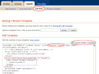
Then we switch to the Edit HTML mode of the Layout editor and click on the Expand Widget Templates check box. (Always remember to back up your template, to restore if something goes wrong). Don't be overwhelmed by the expanded template; it's just like the unexpanded one but with more HTML. Now do a Find (Ctrl+F) for the Title we gave in the above step, inside the expanded template and locate the widget you just added.

This widget will be included as a <b:widget> element in the template. The widget has two parts; its title and the content. Locate the content part of the widget element and encompass that whole section inside a <b:if>...</b:if> element.

The important thing is the condition we provide here. We give the condition as cond='data:blog.pageType == "item"' instructing Blogger to display the content of this widget only if the pageType is equal to 'item'.

The final code snippet will look as follows.

<b:widget id='HTML10' locked='false' title='Popular Pages' type='HTML'>
<b:includable id='main'>
<!-- only display title if it's non-empty -->
<b:if cond='data:title != ""'>
<h2 class='title'><data:title/></h2>
</b:if>
<b:if cond='data:blog.pageType == "item"'>
<div class='widget-content'>
<data:content/>
</div>
</b:if>
<b:include name='quickedit'/>
</b:includable>
</b:widget>


See the figure below for an illustration of this step.


The blue rectangle in the above figure shows the content section of the widget. The two red rectangles show the <b:if> element that we place enclosing the content section.

The same method can be used with the pageType set to 'index', to limit a widget to your blog's homepage.