Introduction
All the standard templates available on Blogger consist of only two columns; a main column where all your blog posts appear and either a left or a right sidebar where you can put various widgets such as About boxes and AdSense units.2 columns are somewhat limiting with respect to the amount of content you can have above the fold. (i.e. in the area above the bottom edge of your browser that is readily visible without having to scroll down) If you can squeeze in an additional 3rd column, that gives you more room to play around with.
This article will explain the basic skeleton of a Blogger template and will lay the foundation for my next article Adding a Third Column. If your are comfortable with things such as outer-wrapper and content-wrapper, then you can skip this article and read the next article straight away. If not, I strongly suggest that you read this first.
The Skeleton
Before you do any changes to your template, you need to understand its basic structure. The key to being able to modify your template is to know how it is made up.The skeleton of a Blogger template is made out of div elements, the magical generic container element of HTML. I used the word magical because of the amazing flexibility offered by the div element with respect to the layout of a website. You will see how flexible it is to change the layout of a blog using the div elements and a little CSS, in the next article.
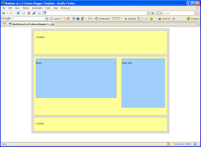
The figure below shows the main compartments of a template.

As you can see, outer-wrapper is the highest level container that encompasses every thing else. Think of it as the grand parent of all the containers in a given blog and it is shown in a gray shading in the above figure. Next level, or the first level child elements (if I'm to use a technical term), consists of 3 containers. They are, from top to bottom, the header, the content and the footer wrappers and are shown in yellow. The light blue boxes are the lowest level of (or the inner-most) containers, and they form the main posts area and the sidebar. Those two are the grand children in this family of containers.
So that is the skeleton or the framework of your template. But we will take a look at a little bit of HTML to get an idea of how this is done in the code. (Don't worry, it isn't that hard)
A Stripped Off Template
Given below is a stripped off, minimalistic version of the body element of your Blogger template. When we take out all the widgets, sections etc. this is what we get. (The full HTML page, including the CSS styles, can be found here)<body>
<div id='outer-wrapper'>
<div id='header-wrapper'>
<p>Header</p>
</div>
<div id='content-wrapper'>
<div id='main-wrapper'>
<p>Main</p>
</div>
<div id='sidebar-wrapper'>
<p>Side Bar</p>
</div>
</div>
<div id='footer-wrapper'>
<p>Footer</p>
</div>
</div>
</body>
<div id='outer-wrapper'>
<div id='header-wrapper'>
<p>Header</p>
</div>
<div id='content-wrapper'>
<div id='main-wrapper'>
<p>Main</p>
</div>
<div id='sidebar-wrapper'>
<p>Side Bar</p>
</div>
</div>
<div id='footer-wrapper'>
<p>Footer</p>
</div>
</div>
</body>
Remember the div element which I mentioned above? The skeleton you see in the above snippet is made entirely out of div's. For each of the wrappers, there is a matching div and the grand parent outer-wrapper is the outer-most div. The others are nested (i.e. included within the <div> and </div> tags of its parent) according to the containment hierarchy we saw in the above figure.
The following screen shot shows how this skeleton page will render on a browser window.

Do you now see it? Your blog, too, has all these boxes. But they are invisible, because in a website, you don't usually highlight the div elements as I have done in the skeleton page. I have applied a background color and dotted borders to each of them, to make them look concrete.
I will not dig in to the CSS behind the skeleton in this article. But when you add a 3rd column to your blog, you have to tinker with the CSS a bit. Let's see how to do that in the next article.


